CSS Grid and Web Components are two great technologies that go great together

by Simon MacDonald
@macdonst
on

Photo by Jackie Hope on Unsplash
Not unlike the combination of chocolate and peanut butter, CSS Grid and Web Components are two great technologies that go great together. If you are anything like me, you too may be CSS challenged. I don’t have enough fingers and toes to count the number of times I have learned CSS Grid syntax. I decided to encapsulate the most common web application layout I use into a web component for convenient re-use.
What is CSS Grid?
CSS Grid is a two-dimensional layout system which enables you to position your components in rows and columns.
Here’s a basic example where I lay out four div’s in a two-by-two grid.
See the Pen Basic CSS Grid Example by Simon MacDonald (@macdonst) on CodePen.
Sure, you could accomplish the same task with ye ole table tag, but CSS Grid offers many additional layout options that you just can’t do with a janky old table without many hacks.
What are Web Components?
Web components are a suite of technologies that allow you to create reusable custom elements that encapsulate structure, style and business logic into one container.
Here’s a really basic example of a web component where we register a hello-world custom element that you can use to say hello to one of your users.
See the Pen Untitled by Simon MacDonald (@macdonst) on CodePen.
Building a Page Layout
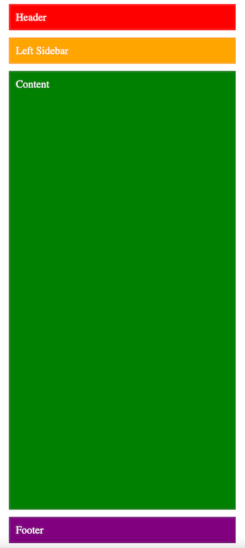
I often recreate the same basic responsive 3-column page layout when starting a new web application. The initial layout consists of a header, left sidebar, a content section and a footer on mobile or small screen sizes.

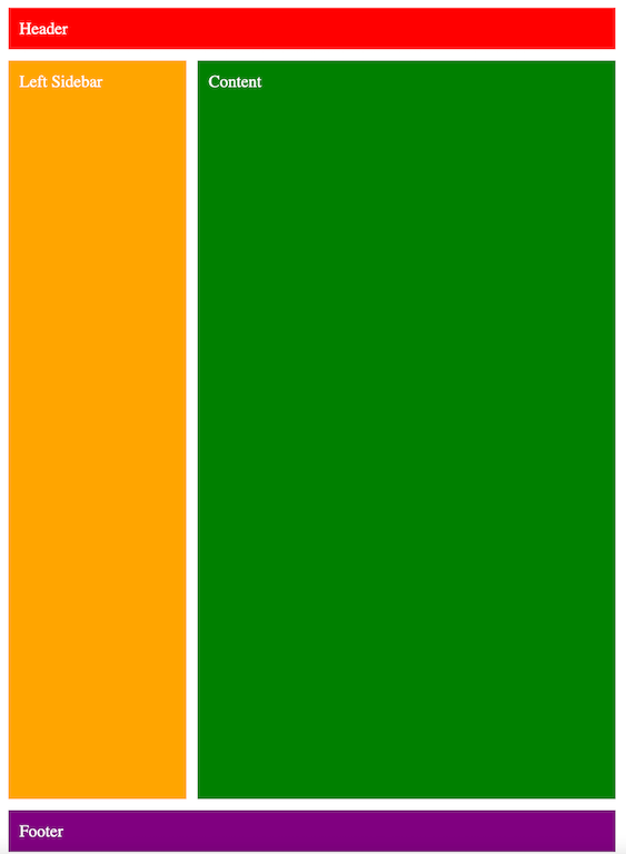
On tablet screen sizes the left sidebar floats to the left side of the content block.

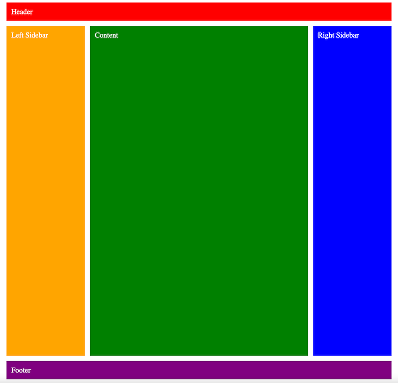
Finally, on large screen sizes the right sidebar appears.

This is a perfect use case for CSS grid and media queries. The CSS for the above layouts would look like:
.right-sidebar {
 grid-area: right-sidebar;
 display: none;
}
.wrapper {
 min-height: 100vh;
 display: grid;
 grid-template-areas:
   'header'
   'left-sidebar'
   'main'
   'footer';
 grid-template-rows: min-content min-content 1fr min-content;
}
@media (min-width: 26rem) {
 .wrapper {
    grid-template:
     'header             header' min-content
     'left-sidebar       main  ' 1fr
     'footer             footer' min-content
     / minmax(auto, var(--layout-max-sidebar-width, 16rem))
       minmax(var(--layout-min-content-width, 16rem), 1fr);
 }
}
@media (min-width: 80rem) {
 .wrapper {
   grid-template:
    'header             header             header' min-content
    'left-sidebar       main               right-sidebar' 1fr
    'footer             footer             footer' min-content
    / minmax(auto, var(--layout-max-sidebar-width, 16rem))
      minmax(var(--layout-min-content-width, 16rem), 1fr)
      minmax(auto, var(--layout-max-sidebar-width, 16rem));
  }
  .right-sidebar {
    grid-area: right-sidebar;
    display: block;
  }
}
The above CSS makes liberal use of grid-template-areas to name sections of our markup and is far superior to specifying column start and end values. The template areas will also make our lives a lot easier as we convert this over to a web component.
Now that we’ve done the hard part, the CSS, let’s build a web component to encapsulate that CSS as a reusable component.
A Page Layout Web Component
For our page layout web component we’ll start off by creating a template element and populating it with the markup we want to use in the form of slots.
const template = document.createElement('template');
template.innerHTML = `
 <slot name="header"></slot>
 <slot name="left-sidebar"></slot>
 <slot name="main"></slot>
 <slot name="right-sidebar"></slot>
 <slot name="footer"></slot>
`
By using named slots we’ll be able to properly place each component in our grid. For example the HTML used to produce the images above would look like this:
<page-layout style="gap: 1rem;">
  <div slot="header" style="background-color: red">
    Header
  </div>
  <div slot="left-sidebar" style="background-color: orange">
    Left Sidebar
  </div>
  <div slot="main" style="background-color: green">
    Content
  </div>
  <div slot="right-sidebar" style="background-color: blue">
    Right Sidebar
  </div>
  <div slot="footer" style="background-color: purple">
    Footer
  </div>
</page-layout>
We can use the CSS pseudo element ::slotted to apply the CSS to the connected slots. For example, the div with the slot name of header will have the grid-area name of header applied to it so that it always shows up at the top of our page.
::slotted([slot='header']) {
    grid-area: header;
}
Then we need a bit of JavaScript to pull everything together. We’ll create a JavaScript class and in its constructor we’ll clone its template and append it to the Shadow DOM and finally register the custom element called page-layout.
class PageLayout extends HTMLElement {
   constructor() {
       super();
       const shadow = this.attachShadow({ mode: 'open' });
       shadow.appendChild(template.content.cloneNode(true));
   }
}
customElements.define('page-layout', PageLayout);
Here’s a CodePen that pulls the entire thing together.
See the Pen Page Layout Web Component by Simon MacDonald (@macdonst) on CodePen.
Room for Improvement
While this is a good use of web components to encapsulate CSS grid and save me the need to re-learn the syntax yet again there is some room for improvement. Specifically:
- The layout won’t work without JavaScript enabled which is not ideal.
- There can be a flash of unstyled content as the web component is loaded. The layout will default to the single column mobile layout and once the JS is loaded it will load the corresponding CSS to properly display the mobile, tablet or desktop layout.
- The breakpoints for the mobile and desktop layouts are hard coded. Although, we can pass these breakpoints in as attributes to the web component and update the style once we receive the connected callback, see this CodePen, but that’s out of scope for this blog post.
Web Components are great but I still think we can do more to improve or eliminate the problems I’ve identified. If only it was possible to server side render web components. 😉
