Above the Clouds With the New Enhance Landing Page

by Cole Peters
@colepeters@mastodon.online
on
Those of you who’ve visited the Enhance website recently may have noticed a big change: we launched our first proper landing page! Although this project was primarily my baby over the last couple months, a lot of other folks were involved — from the stellar (and heartwarming) design & illustrations by Dani Raskovsky, to art and content direction by our very own kj, and additional ideas and feedback from the rest of the Begin team. We’re all thrilled to have this project out in the world, and we hope you’re as delighted as we are with it.
This is one of the most substantial projects we’ve put Enhance itself to work on to date, so we thought this would be a great opportunity to take you under the hood — or through our ‘view source’, if you will — to cover some of the implementation details and our strategies behind them. We hope this will give you some ideas for your own Enhance projects — and beyond that, we hope this goes to show just how much you can do using web standards these days.
Design strategy
Developing a distinct identity for Enhance has been a priority for us from the outset, but our new landing page absolutely revels in the spirit of playfulness and delight we always wanted to imbue our framework (and our work in general) with.
If you ask us, the world of web technology has become a little stale in recent years when it comes to design. Many of us on the Begin team love to reminisce over the whimsical age of personal websites built on Tripod, Geocities and the like — a time of unbounded personal expression and fascination with the rapidly expanding toolkit of web design. Scrolling marquees, blink tags, copious animated GIFs, and unpausable background music powered by MIDI may not be considered best practices today, but we definitely look back on these artifacts with a lot of fondness.
Today, a lot of the web looks the same — especially when it comes to sites for web technologies. Pared back but not stark, clean and inoffensive sans serif typefaces, rounded corners, a few subtle drop shadows, maybe some blob people illustrations… it’s not that there’s anything wrong with this kind of design language or any of these attributes, but it does get repetitive (and even hard to distinguish).
With Enhance, we wanted to return to something more quirky, friendly, exuberant, and joyful. Crafting a personality that was immediately welcoming was also critical for us — we want to welcome everyone to the world of Enhance (and the wider world of the web), regardless of previous experience or identity. We want folks to start having fun on the web again, and we hope our new landing page declares that intention both loudly and proudly!
Open arms in action: prioritizing accessibility
Accessibility is sometimes regarded as a nice to have — a feel good thing that we’ll get to if nothing else gets in the way. After all, how many people will actually be affected by our decisions (or lack thereof) on accessibility?
According to the World Health Organization and the CDC, 16% of the world’s population, and 26% of the U.S. population, have a disability. That’s over 1 billion people worldwide and around 86 million people in the U.S. who may be unable to access websites that are not designed with accessibility in mind.
From a cold-hearted business perspective, turning away one in six people (or one in four Americans) is a huge loss. But more fundamentally (and importantly), making sure those folks have the best possible chance of engaging positively with your work isn’t just carrying out good business — it’s being a good member of human society. To that end, we paid particular attention to the accessibility of the Enhance landing page.
When it comes to visual accessibility, aspects like color contrast and perception, allowing for motion reduction, and strong typography are critical considerations. While designing and building out the landing page, we kept an eye on our WCAG and APCA ratings, and reviewed our work with color blindness simulators to ensure information wasn’t lost in translation.
Much of our landing page makes use of animations (which I’ll cover in more detail later in the article), but we also know that not everyone loves animations. I have friends with ADHD and other cognitive disabilities who find excessive animations extremely distracting — and these animations can even impair recall. Or, consider those with vestibular disorders who can experience nausea, headaches, and even more problematic symptoms just because of animations, even after those animations have passed. I wouldn’t wish this on anyone, nor would I want to be the cause of such distressing episodes.
Because of this, all of our landing page’s animations include fallbacks for the prefers-reduced-motion media query. This means that users who have set a preference in their operating system to reduce the GUI’s use of motion won’t have to deal with animations they’ve already requested to opt out of. (In fact, the day after launching the landing page, Manuel Matuzović sent out a lovely toot about this aspect of the page, and a great discussion followed.)
Accessibility can also encompass typography. It’s been estimated that somewhere around 25% of the global population suffer from presbyopia (a type of vision deterioration making it hard to see things up close), with around half of those people unable to access corrective treatment. Many of us will begin to experience this condition ourselves by the time we reach middle age (my vision’s been far worse than that since adolescence), if not other forms of retinal disorders. Even for those of us without a particular visual impairment, small typography can be annoying to say the least, but thankfully, good typography is often just a matter of following simple best practices.
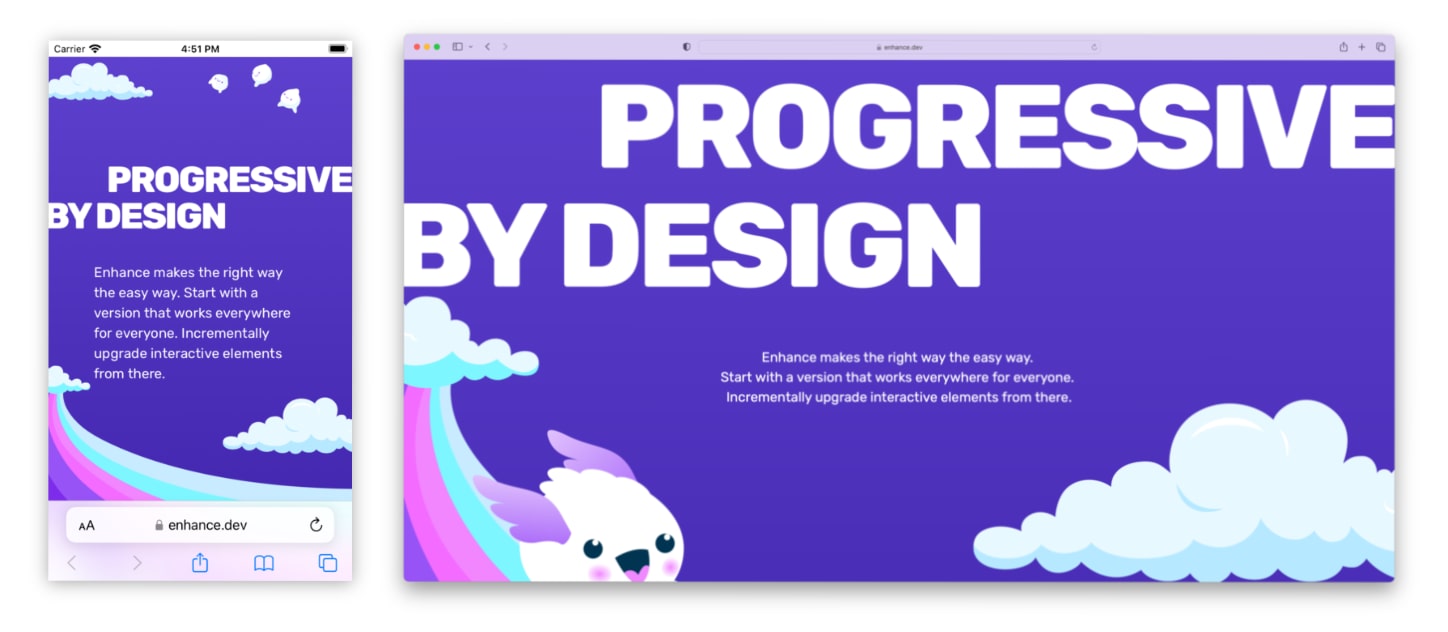
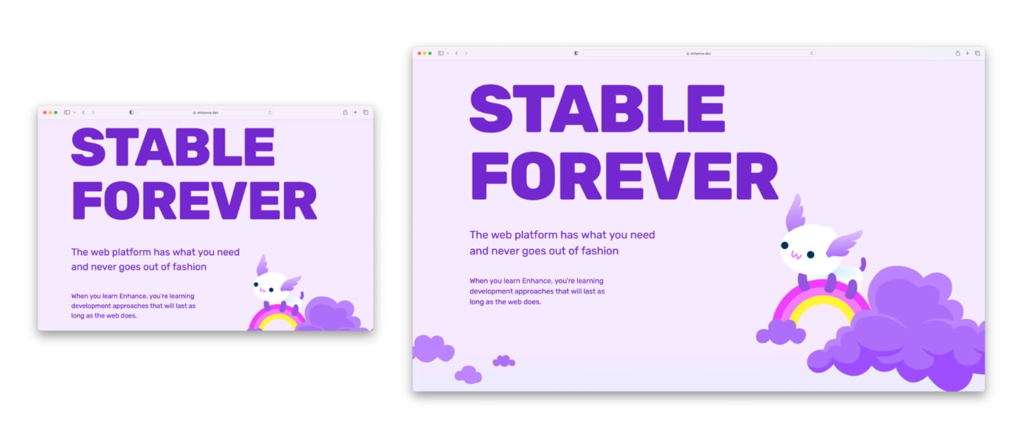
This, among other reasons, is why we make sure to use widely legible text sizes by default in our work (16px is a standard starting point), including on the Enhance landing page. We also ensured text was responsive to users’ text sizing preferences (for example: text should resize appropriately if the user zooms in, or if the user has set a default text size that differs from the browser default). There were just a few exceptions to this: several sections of display type on the page needed to be explicitly sized based on the viewport width (see an example below), but in these instances we also set minimum rem based font sizes using CSS min, max, and clamp functions, or simply set the type large enough that it shouldn’t ever drop below a legible range (as in the example below, where one or two words are nearly full width even on a small device). That said, if you do spot an issue in legibility (or any other accessibility concern), feel free to file an issue or let us know on Discord!
Speaking of typography, let’s talk about…
Fluid typography and layout
One of the most interesting aspects of the design of our landing page is that it’s almost entirely a fluid, single column layout. After so many years of building with adaptive and responsive grid layouts by default, building out a single column layout that works as well on a small phone as it does on a 27” monitor ended up being an unexpectedly tough and nuanced challenge.
The use of fluid typography and spacing ended up being a big part of the solution to this challenge. I’ve already touched on typography sized with viewport units in the previous section, but here I’m referring specifically to the kind of fluid type and layout techniques championed by the likes of Utopia. You may already be familiar with the concept of using modular scales for sizing typography and spacing units — and if you are, you know that one the most time consuming and potentially frustrating aspects of using these scales is having to iterate on them across multiple breakpoints. For example, you might want to set a first level heading element at a moderate font size on small devices, but then scale that font size larger on medium devices, and up to a maximum size on large devices. Or you may want to scale whitespace via padding in a similar fashion. Using functional CSS, this can look something like:
<h1 class='text2 text3-md text4-lg text5-xl'>…</h1>
<!-- or… -->
<section class='padding4 padding5-md padding6-lg'>…</section>
While this is a tried and true technique that has worked reasonably well for many years now, it shares a problem with any other breakpoint-scoped style: that hard shift in layout at the boundaries of each breakpoint. In other words, a user working with a 1199px wide viewport could get an entirely distinct layout compared to a user on a 1200px wide viewport. Given the virtually infinite range of viewport sizes that exist in the wild, the decision of exactly when to make certain typographic and spatial changes within that spectrum quickly becomes arbitrary and awkward (something one of the coauthors of Utopia has written about in detail).
This is where fluid typography and spacing shine. As designers and developers, we can stop fussing about a potentially infinite array of typographic and spatial variations, and instead focus almost entirely on the extremes: ‘What size should this type be at a minimum, and what size should it be at a maximum?’ Or, ‘How far away should element A be from element B at a minimum, and how far away should it be at a maximum?’
In the case of the Enhance landing page, using fluid type and spacing helped to reduce typographic and layout problems to a much more reasonable size. All of the typography on the landing page (except for a few aforementioned cases) is sized using output from Utopia, as are most of the margins and paddings that help situate each element on the page in relation to others. This allowed us to start with a relatively compact layout on small screens, and have that layout scale up fluidly to much larger screens without having to use any breakpoint-scoped styles (except in a few small sublayouts where we wanted to move from a single to double column format when space was available). Given the complexity of the layout (if it’s not obvious, this page has a LOT of layers and assets at play!), this fluid approach saved us both a ton of time and a fair bit of code in bringing the page to life. In fact, we had so much success using fluid type and spacing that we’ve already started investigating the best possible way to bring this methodology into Enhance Styles. (You can follow this issue if you’re interested!)
SVGs: not just for illustrations!
The last trick we pulled out of our sleeves in terms of typography on the landing page was using type rendered with SVG. Despite being pretty nerdy about typography, I admittedly was recently surprised to find out that text can indeed be rendered accessible to both sighted users and those using screen readers with the use of SVG graphics. This technique proved useful specifically for a couple of instances where we need to scale type based on the width of another element — for example, in the section shown below where we wanted to scale the words ‘web components’ symmetrically with the ‘SSR’ cloud typography, which wouldn’t have been possible to do via font-size.
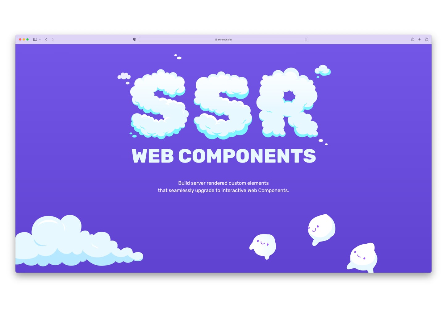
Here, the ‘web components’ text is rendered with SVG’s <text> element. Because this renders actual type (rather than type outlined as vector graphics), it remains accessible to both screen readers and document parsers, and we can do things like typeset it with CSS — for example: apply our web font, set it in uppercase, use the extra bold font weight, etc. In fact, if you use an HTML page outliner tool on the landing page, you’ll notice that the ‘SSR Web Components’ graphic gets parsed just the same as any other h2 element would, thanks both to the SVG <text> element and the inclusion of a visually hidden (but still accessible) span containing the term ‘SSR’. Check out the reduced and commented code reproduction below to see this in action:
<h2 class="font-extrabold uppercase m-auto">
  <!-- Custom element for the 'SSR' cloud type: -->
  <landing-ssr-type class="si-100 mb0">
    <svg…></svg>
  </landing-ssr-type>
  <!-- Invisible but accessible text for 'SSR': -->
  <span class="clip">SSR</span>
  <!-- 'Web components' SVG text: -->
  <svg
    viewBox="0 0 969 75"
    xmlns="http://www.w3.org/2000/svg"
    class="webComponentsType">
    <text fill="#E8F8FF" font-family="Rubik" font-size="101.48">
      <tspan y="72.7569">Web Components</tspan>
    </text>
  </svg>
</h2>
Of course, a few custom pieces of typography aren’t the only SVGs you’ll see on our landing page. SVG is a fantastic format to work with for graphics as long as you’re not rendering photographs or highly complex three dimensional imagery. Since it’s a graphics format built from standards based XML, it’s both parsable and able to be styled by the browser. This also means that SVG content can be used in custom elements and web components, a strategy I used liberally for our landing page. Finally, being vector based, SVGs can also be resized infinitely without a loss in quality, while compressing to far smaller file sizes than bitmap formats like JPG and PNG.
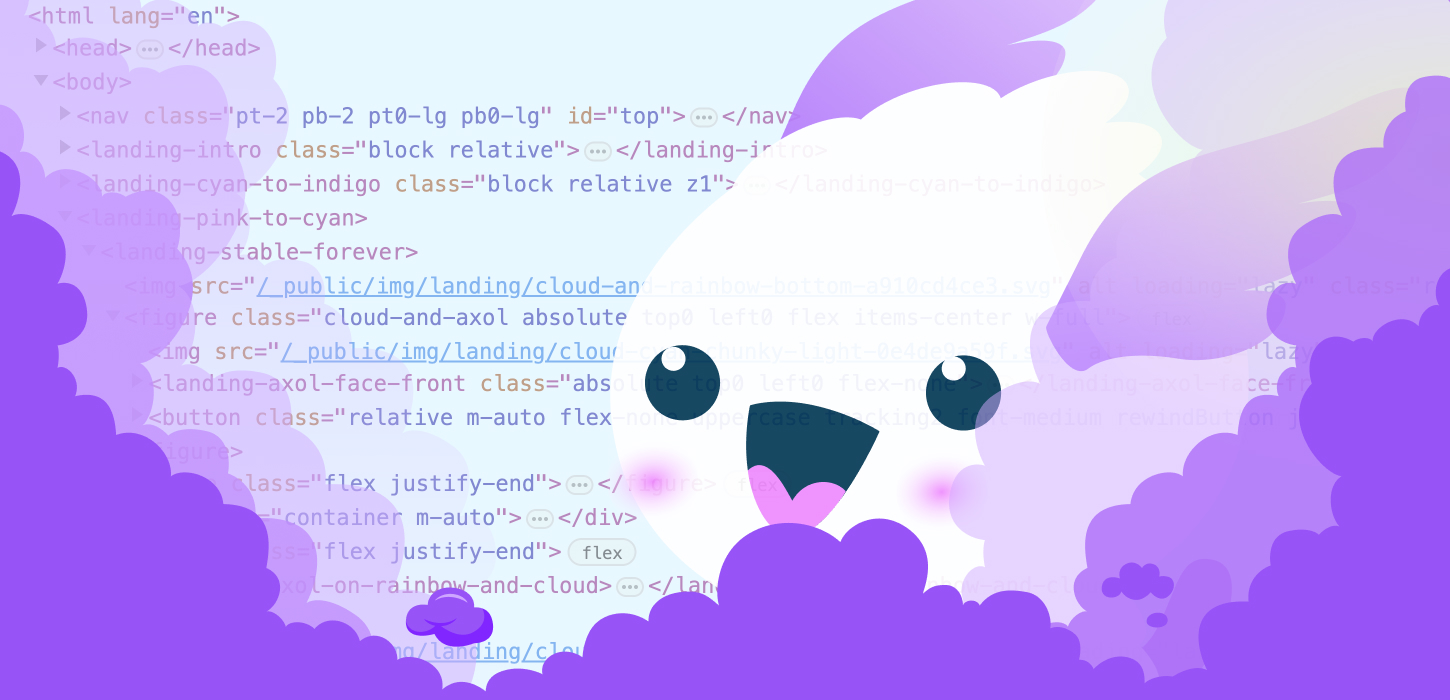
Over 40 other SVG assets are used to create the lush world of Axol and their friends, but thanks to the aforementioned compression, this all amounts to just 104kb over the wire (which is itself about a quarter of the total kilobytes transferred for the whole page). Compared to what our image payload would’ve been if we’d used PNG or JPG images, this is a massive savings in both page size and loading speed, which both we and our users appreciate. Furthermore, because our landing page is so incredibly tall, the lion’s share of these images initially appear offscreen; as such, we decided to load those images asynchronously as they approach the visible viewport by using the loading='lazy' attribute.
Two examples of SVGs worth digging into are the code blocks we show on the page — one demonstrating Enhance’s project structure, and another showing an example of writing a client side update to a web component:
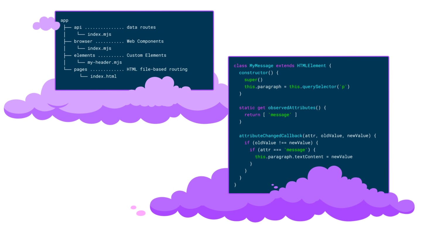
These two SVGs were actually fairly tough to get right, for a somewhat frustrating reason: almost no modern graphics program seems to emit anything close to clean SVG code when multiline text is involved — and because we want to style the text in these images and have it exposed to technologies like screen readers, simply tossing a bunch of SVG markup into an external image request was simply not possible. For example, when opting not to convert text to outlines, Figma’s export renderer for some reason chooses to slice and dice individual characters and word fragments seemingly at random, spitting out a ton of unnecessary tspan elements that would frankly never be possible to work with in a code editor. Many other SVG editors I tried found other ways to mutate my text in baffling ways. Here’s an excerpt from Figma’s SVG output:
<svg
viewBox="0 0 970 570"
fill="none"
xmlns="http://www.w3.org/2000/svg">
<!-- skipping ahead to the code block… -->
<g id="code">
<text
fill="#74F1FF"
xml:space="preserve"
style="white-space: pre"
font-family="Roboto Mono"
font-size="15"
letter-spacing="0em">
<tspan x="451.63" y="277.826">C</tspan>
</text>
<text
fill="white"
xml:space="preserve"
style="white-space: pre"
font-family="Roboto Mono"
font-size="15"
letter-spacing="0em">
<tspan x="433.612" y="109.826">paragraph</tspan>
<tspan x="595.771" y="277.826">attr</tspan>
<tspan x="649.823" y="277.826">o</tspan>
<tspan x="739.911" y="277.826">n</tspan>
<tspan x="424.604" y="301.826">o</tspan>
<tspan x="541.718" y="301.826">n</tspan>
<tspan x="442.621" y="325.826">attr</tspan>
<tspan x="469.647" y="349.826">paragraph</tspan>
<tspan x="559.735" y="349.826">t</tspan>
<tspan x="685.858" y="349.826">n</tspan>
</text>
<text
fill="#00F500"
xml:space="preserve"
style="white-space: pre"
font-family="Roboto Mono"
font-size="15"
letter-spacing="0em">
<tspan x="397.577" y="85.8264">uper</tspan>
<tspan x="397.577" y="109.826">his</tspan>
<tspan x="550.727" y="109.826">his</tspan>
<tspan x="712.885" y="109.826">'p'</tspan>
<tspan x="469.647" y="205.826">'message'</tspan>
<tspan x="523.7" y="325.826">'message'</tspan>
<tspan x="433.612" y="349.826">his</tspan>
</text>
</g>
<!-- etc -->
</svg>Along the way, I discovered that an app I sometimes use for bitmap editing — Pixelmator — also works with SVGs, and its multiline text output is actually quite respectable (though it didn’t seem to allow me to apply multiple text colors to a single text block). Thus, the solution I finally landed on was:
- Take the exports from our Figma design files
- Throw them into Pixelmator
- Replace Figma’s text output by pasting the raw text back into Pixelmator
- Output these results from Pixelmator
- Finally, fine tune the results by hand in code — for example, by inserting my own
tspanelements to apply the appropriate color fills as needed for syntax highlighting
To vastly understate my feelings on this process, it was not ideal. However, this did end up saving us around 300kb of code as compared to using the raw SVG output with outlined text, in addition to allowing us to style the text and have it exposed to assistive technologies. (Relatedly, if anyone out there is working on an SVG editing tool: if you manage to come up with an export format that makes multiline text in SVGs easier to work with as code, I have a hug waiting for you.)
Animations: bringing Axol to life
Animation was a key consideration for the Enhance landing page from the beginning of the project, even before I came onboard. Earlier in this article, I mentioned how many of us Beginners look back fondly on the marquee and blink tags of years past; luckily it was pretty easy to bring these sorts of animations back to life with CSS! An article from Ryan Mulligan provided a great example of how to build a modern, responsive marquee with CSS; meanwhile, memories of the blink tag were revived via several of our Axols’ blinking eyes.
Other animations fell into place pretty easily but took some fine tuning to perfect. The Axols on swings underneath our ‘HTML first’ marquee, for example, are animated simply via the rotate property, but the precise timing of each (as well landing on an appropriate timing function) took a few iterations to get just right. I really love how these two Axols drift in and out of sync with each other as they swing lazily back and forth. (Sometimes I feel like I’m starting to get hypnotized by them if I stare at them too long… thankfully I don’t think Axols are prone to too much mischief.) If you’re curious, here’s the code for the blue swinging Axol — the only difference with the pink Axol is a very slightly longer animation duration. Small input, big output!

Another animation that ended up giving back so much more energy than was put into is the Axol at the bottom of the landing page who intermittently offers their flower to the user. I’m proud to say I came up with this concept on my own, but I can’t take too much credit — this animation is also just adjusting the rotate property on several SVG groups: the front arm, back arm, and flower. Here’s the code if you’d like to take a peek — the SVG content is a little verbose, but you’ll get the idea I’m sure.
None of these animations were terribly hard to implement, but there were definitely others than took quite a lot of corralling to get right. A prime example here is the Axol that flies across the screen, trailing a ‘No JS required’ banner behind them.
No JS (though some visual trickery) required
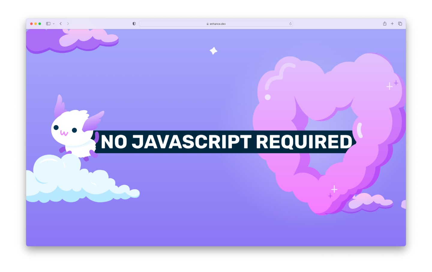
The initial challenge with this animation was the layering: Axol and their banner needed to appear to come through the heart cloud, which meant one half of the cloud needed to be stacked behind Axol and the banner, with the other half in front. Then I went and made things harder for myself by deciding the heart cloud also needed to gently pulsate like a real heart.
To put this all together, I started by making a single component for Axol and the ‘No JS required’ banner. Not much magic here — an image, a bit of styled text, and some relative offsets along with flexbox to line everything up. Then it was time for some open heart surgery: I sliced up the heart cloud into two halves, so that I could stack one half on top, Axol and their banner in the middle, and the other half of the heart cloud below.
This didn’t quite work out at first. Due to the fluid size of these images and the way antialiasing works, the heart cloud sometimes rendered with a tiny subpixel gap of space between its two halves. My friend Robyn, an amazing designer and artist herself, had some great advice for me here: all I needed to do was give each half of the graphic a 1px overlap, and then collapse that overlap when stacking the images up. That way, whenever that subpixel gap appears, it’s effectively canceled out by the 1px overlap that’s revealed underneath. Because these images are sized fluidly, I ended up having to compute the overlap in percentages based on the images’ intrinsic widths, but the result worked perfectly. You can take a look at the code for this here, if you’d like.
The final step in this animation was to get Axol to actually fly out with the banner in tow. This was solved with a transition of the translate property, triggered with the Intersection Observer API. In short: once the heart cloud is detected to be at least 33% visible in the viewport, a JavaScript handler modifies the translate property on Axol and the banner. Because the translate property is declared to be transitional (via the transition property), we end up seeing Axol fly across the screen with the banner in tow. Take a look at the CSS behind this if you like!
Because these animations are triggered by JavaScript, however, I also needed to account for what a user would see if JavaScript failed to load or was blocked. Consequently, Axol and the banner are first rendered on the server at the static, completed stage of the animation. Then, when JavaScript first kicks in on the client, I reposition Axol and the banner to the starting position required for the animation. After this, the IntersectionObserver handler takes care of the rest. I also needed to make sure this animation isn’t run for users with the reduced motion preference, so this JavaScript is kept behind a guard which first checks for this preference using the matchMedia method.
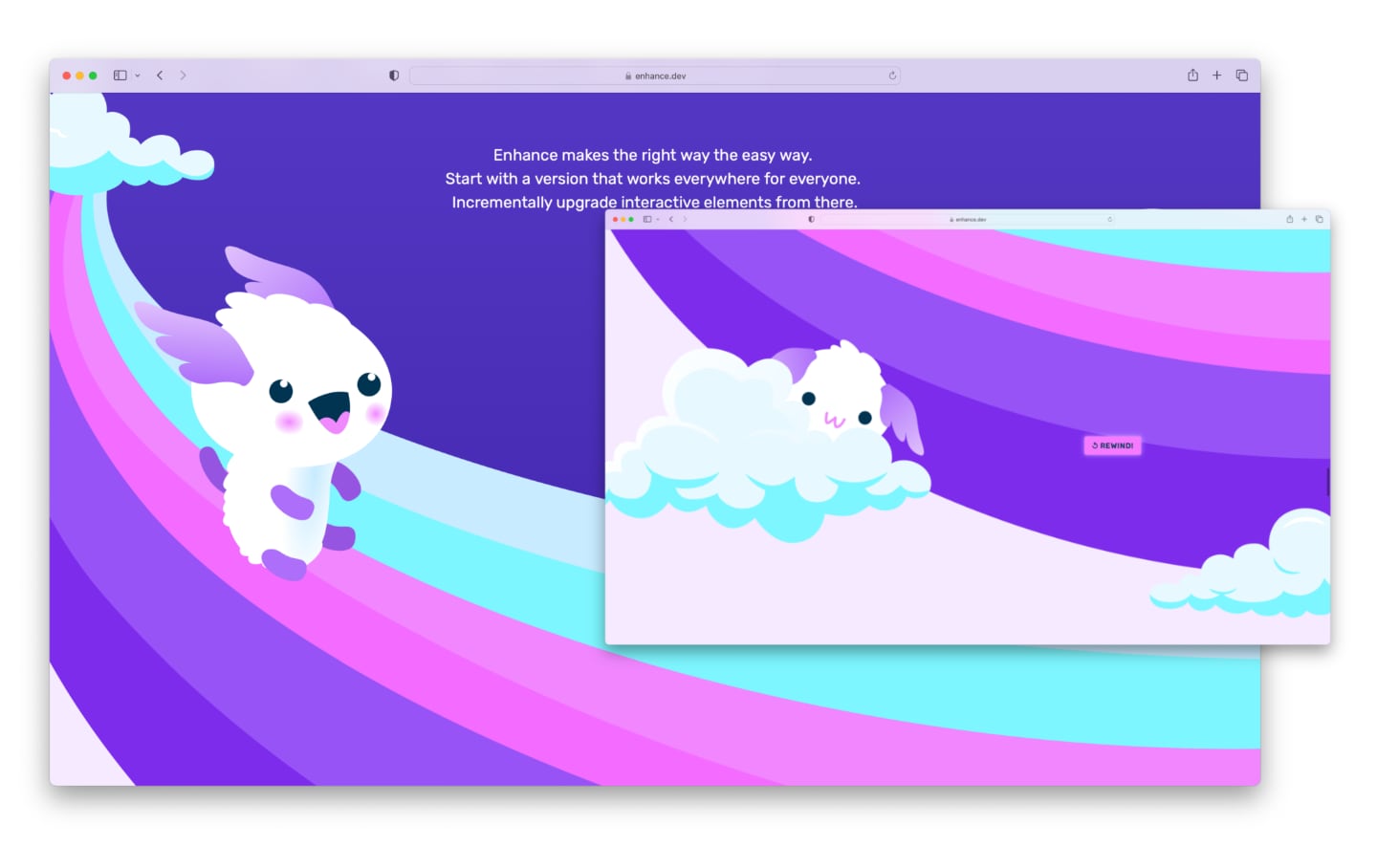
This same approach was used to animate a few other Axols on our landing page, including the Axol that slides down the large rainbow and subsequently pops out of a cloud beneath. This animation used some slightly different techniques — in this case, swapping out classes rather than modifying custom property values directly — but the principle remains the same. I also used an SVG to define Axol’s path down the rainbow via the offset-path property; CSS Tricks has a great summary of this technique if you’d like to dig further into it, or you can take a look at the CSS and the JavaScript behind this particular animation if you’d like!
Ready for liftoff
It’s been a blast putting our new landing page together, and putting Enhance itself to use to produce such a dynamic, intricate, yet effective and performant web page (feel free to check out our scores on Page Speed Insights).
It’s interesting to consider that this entire page could have reasonably been built without Enhance — after all, it’s mostly just static HTML, CSS, and a sprinkling of vanilla JavaScript (which, unlike a lot of server rendered output out there these days, is perfectly readable by humans when viewing the page source in your browser — try it out)!
What Enhance added to the experience of working with these web standards really came down to making my authoring experience magical. Single File Components allowed me to colocate related markup, styles, and scripts in a compartmentalized and straightforward way (which is even surfaced in the custom element names when viewing the page source); Enhance Styles gave me a configurable utility class system as well as component scoped styles, both of which made building out typography, layout, and animations a breeze; API routes made it a cinch to implement our email signup form (using an actual HTML form and HTTP requests — no form library or third party data management layer needed here); and of course, deploying with Begin gave us server side rendering, deterministic builds, and super fast response times, all within independently scalable environments.
At the end of the day, while a lot of skilled folks spent a lot of time making this landing page a reality, it’s thrilling for me to know that — technically speaking — anyone with an intermediate level of experience with HTML, CSS, and a tiny bit of JavaScript could reasonably build out a landing page of this caliber using Enhance themselves, all with an extremely minimal lead time to learn the framework’s ropes. I can’t wait to see the incredible work that folks in the wild will put together with Enhance, and I hope that our new landing page inspires you to dive into a project of your own soon!