OS Selector for Documentation Sites

by Simon MacDonald
@macdonst@mastodon.online
on
The other day while I was browsing through Mastodon I saw a post from my buddy Ray Camden.
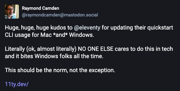
Well, when Ray is right he’s very right. There are two things in this post that I agree with 1000%. First, the docs team at 11ty.dev do a bang up job. Secondly, more sites should have an operating system (OS) selector in their docs so developers can get command line instructions in the OS they use.
We’ve supported this in our docs for quite awhile now. In this post I’ll take you through our implementation and provide a no dependency shadow DOM version.
What we will build
We need a component that fulfills the following requirements:
- Allows the user to select between Mac/Linux and Windows commands.
- Persists the preference between visits.
- Updates all instances of the component on the page.
If we provide the HTML:
<deploy-docs-commands>
  <deploy-docs-command>
    rm fake.tmp
  </deploy-docs-command>
  <deploy-docs-command os="win">
    del fake.tmp
  </deploy-docs-command>
</deploy-docs-commands>
It’ll should produce a component that works like this:
Note: You may wonder why we never talk about the deploy-docs-command component in this blog post and that is because there are no implementation details. We never define this custom element. We just use it as a convenient way to wrap our commands as we are taking advantage of the browser feature where undefined custom elements are treated as a span.
The Enhance version
Getting started building our component we’ll install our dependencies:
npm install @enhance/custom-elementThen we’ll create a new file called app/components/deploy-docs-callout.mjs. In this case we are creating a component instead of an element as we will require client side interactivity.
OS Switch
To start with we’ll define our render method. This is where we’ll create our custom element template. A component’s render method will be run by the Enhance SSR process on the server and is able to run again on the client if the component changes.
import CustomElement from '@enhance/custom-element'

export default class DocsCommands extends CustomElement {
  render({ html }) {
    return html`<style>
    :host {
      display: block;
      margin-block: var(--space-0);
    }

    .toggle input {
      display: none;
    }

    :host > div {
      background-color: hsl(0deg 0% 50% / 0.125);
    }

    label {
      cursor: pointer;
      font-weight: 500;
      color: var(--accent);
    }

    svg {
      aspect-ratio: 1 / 1;
      height: 1rem;
      color: var(--fore);
    }

    .slider {
      width: 32px;
      height: 16px;
      border-radius: 1rem;
      background-color: var(--accent);
    }

    .slider:before {
      position: absolute;
      width: 14px;
      height: 14px;
      top: 1px;
      bottom: 1px;
      left: 1px;
      content: "";
      background-color: white;
      border-radius: 50%;
      transition: transform 0.15s ease-in-out;
    }

    input:checked  .slider:before {
      transform: translateX(1rem);
    }
  </style>

  <slot></slot>

  <div class='text-end pbs-6 pi-4'>
    <label class="toggle inline-flex gap-5 align-items-center text-1">
      <svg>
        <use xlink:href="#icon-apple"></use>
      </svg>
      <svg>
        <use xlink:href="#icon-linux"></use>
      </svg>
      <input type="checkbox" name="toggle-windows" value="windows" role="toggle" aria-label="Toggle Windows" />
      <div class="slider relative round inline-block"></div>
      <svg>
        <use xlink:href="#icon-windows"></use>
      </svg>
    </label>
  </div>
`
  }
}

customElements.define('deploy-docs-commands', DocsCommands)
Now that our HTML is in place let’s add some interactivity starting with switching between command line instructions. In our DocsCommand class we’ll add a constructor where we’ll save references to our component’s internals.
constructor() {
    super()
    this.winInput = this.querySelector('input[type="checkbox"]')
    this.codeBlock = this.querySelector('deploy-docs-command:not([os])')
    this.winCodeBlock = this.querySelector('deploy-docs-command[os="win"]')

    this.onSwitchChange = this.onSwitchChange.bind(this)
}
Then we need to implement our connectedCallback and disconnectedCallback methods:
  connectedCallback() {
    this.winInput.addEventListener('change', this.onSwitchChange)
  }

  disconnectedCallback() {
    this.winInput.removeEventListener('change', this.onSwitchChange)
  }
Now anytime the user clicks on our switcher the onSwitchChange method is fired. Speaking of that: we also need to implement that method. When the user clicks on our switch we need to update the state of our hidden checkbox, and then update which OS command is shown.
  onSwitchChange(e) {
    const preferWin = e.srcElement.checked
    this.update(e.detail)
  }
Finally our update method shows/hides the correct OS instructions:
  update(preferWin) {
    this.winInput.checked = preferWin

    if (preferWin) {
      this.codeBlock.classList.add('hidden')
      this.winCodeBlock.classList.remove('hidden')

    } else {
      this.winCodeBlock.classList.add('hidden')
      this.codeBlock.classList.remove('hidden')
    }
  }
A full code listing of what our web components looks like at this point would be:
import CustomElement from '@enhance/custom-element'

export default class DocsCommands extends CustomElement {
  constructor() {
    super()
    this.winInput = this.querySelector('input[type="checkbox"]')
    this.codeBlock = this.querySelector('deploy-docs-command:not([os])')
    this.winCodeBlock = this.querySelector('deploy-docs-command[os="win"]')

    this.onSwitchChange = this.onSwitchChange.bind(this)
  }

  connectedCallback() {
    this.winInput.addEventListener('change', this.onSwitchChange)
  }

  disconnectedCallback() {
    this.winInput.removeEventListener('change', this.onSwitchChange)
  }

  onSwitchChange(e) {
    const preferWin = e.srcElement.checked
    this.update(e.detail)
  }

  update(preferWin) {
    this.winInput.checked = preferWin

    if (preferWin) {
      this.codeBlock.classList.add('hidden')
      this.winCodeBlock.classList.remove('hidden')

    } else {
      this.winCodeBlock.classList.add('hidden')
      this.codeBlock.classList.remove('hidden')
    }
  }

  render({ html }) {
    // removed for brevity
  }
}

customElements.define('deploy-docs-commands', DocsCommands)
Persisting OS Preference
Our component is working pretty well so far but if our user navigates to a new page their preferred OS selection will be lost. In this section we’ll add a way to preserve the user’s preference.
We are going to use localStorage to save which OS the user has selected. At the top of app/components/deploy-docs-callout.mjs we’ll add a constant.
const PREFERRED_OS_KEY = 'preferredOs'Then in our constructor we’ll load the preference and call our update method to make sure the correct instructions are being shown.
const preferredOs = window.localStorage.getItem(PREFERRED_OS_KEY)
this.update(preferredOs === 'win')
Over in our onSwitchChange method we add some code to persist our preference in localStorage.
if (preferWin) {
    window.localStorage.setItem(PREFERRED_OS_KEY, 'win')
} else {
    window.localStorage.removeItem(PREFERRED_OS_KEY)
}
Great! Now when users move from page to page on our doc site their OS preference is respected.
Here is a diff of our component after adding persistence:
import CustomElement from '@enhance/custom-element'

+ const PREFERRED_OS_KEY = 'preferredOs'

export default class DocsCommands extends CustomElement {
  constructor() {
    super()
    this.winInput = this.querySelector('input[type="checkbox"]')
    this.codeBlock = this.querySelector('deploy-docs-command:not([os])')
    this.winCodeBlock = this.querySelector('deploy-docs-command[os="win"]')

    this.onSwitchChange = this.onSwitchChange.bind(this)

+    const preferredOs = window.localStorage.getItem(PREFERRED_OS_KEY)
+    this.update(preferredOs === 'win')
  }

  connectedCallback() {
    this.winInput.addEventListener('change', this.onSwitchChange)
  }

  disconnectedCallback() {
    this.winInput.removeEventListener('change', this.onSwitchChange)
  }

  onSwitchChange(e) {
    const preferWin = e.srcElement.checked

+    if (preferWin) {
+      window.localStorage.setItem(PREFERRED_OS_KEY, 'win')
+    } else {
+      window.localStorage.removeItem(PREFERRED_OS_KEY)
+    }

    this.update(e.detail)
  }

  update(preferWin) {
    this.winInput.checked = preferWin

    if (preferWin) {
      this.codeBlock.classList.add('hidden')
      this.winCodeBlock.classList.remove('hidden')

    } else {
      this.winCodeBlock.classList.add('hidden')
      this.codeBlock.classList.remove('hidden')
    }
  }

  render({ html }) {
    // removed for brevity
  }
}

customElements.define('deploy-docs-commands', DocsCommands)
Update all instructions on the page
The downside to our implementation as it stands is that when the switch is flipped it only updates the current instructions. However, we want it to update all the instructions on the page.
To do that we are going to fire a CustomEvent to update all the deploy-docs-callout on the page. We’ll need a new event handler so we’ll start by binding it in our constructor.
this.onOsChange = this.onOsChange.bind(this)Next, we’ll register our event listener in our connected/disconnected callbacks.
connectedCallback() {
  this.addEventListener('preferWinChange', this.onOsChange)
  this.winInput.addEventListener('change', this.onSwitchChange)
}

disconnectedCallback() {
  this.removeEventListener('preferWinChange', this.onOsChange)
  this.winInput.removeEventListener('change', this.onSwitchChange)
}
Then we can define our onOsChange event listener.
onOsChange(e) {
  this.update(e.detail)
}
Finally in our onSwitchChange method we no longer need to call update directly. Instead we’ll fire our preferWinChange on every deploy-docs-callout component on the page and let our onOsChange event listener handle calling update.
Here’s another diff of what the component looks like.
import CustomElement from '@enhance/custom-element'

const PREFERRED_OS_KEY = 'preferredOs'

export default class DocsCommands extends CustomElement {
  constructor() {
    super()
    this.winInput = this.querySelector('input[type="checkbox"]')
    this.codeBlock = this.querySelector('deploy-docs-command:not([os])')
    this.winCodeBlock = this.querySelector('deploy-docs-command[os="win"]')

+    this.onOsChange = this.onOsChange.bind(this)
    this.onSwitchChange = this.onSwitchChange.bind(this)

    const preferredOs = window.localStorage.getItem(PREFERRED_OS_KEY)
    this.update(preferredOs === 'win')
  }

  connectedCallback() {
+    this.addEventListener('preferWinChange', this.onOsChange)
    this.winInput.addEventListener('change', this.onSwitchChange)
  }

  disconnectedCallback() {
+    this.removeEventListener('preferWinChange', this.onOsChange)
    this.winInput.removeEventListener('change', this.onSwitchChange)
  }

+  onOsChange(e) {
+    this.update(e.detail)
+  }

  onSwitchChange(e) {
    const preferWin = e.srcElement.checked

    if (preferWin) {
      window.localStorage.setItem(PREFERRED_OS_KEY, 'win')
    } else {
      window.localStorage.removeItem(PREFERRED_OS_KEY)
    }

-    this.update(e.detail)
+    const event = new CustomEvent('preferWinChange', { detail: preferWin })
+    for (const elem of document.querySelectorAll('deploy-docs-commands')) {
+      elem.dispatchEvent(event)
+    }
  }

  update(preferWin) {
    this.winInput.checked = preferWin

    if (preferWin) {
      this.codeBlock.classList.add('hidden')
      this.winCodeBlock.classList.remove('hidden')

    } else {
      this.winCodeBlock.classList.add('hidden')
      this.codeBlock.classList.remove('hidden')
    }
  }

  render({ html }) {
    // removed for brevity
  }
}

customElements.define('deploy-docs-commands', DocsCommands)
If you change the preferred OS in the component below your preference will be reflected in the component at the top of the page.
A full code listing is also available.
The Shadow DOM Version
While the Enhance component can be used on any website some folks prefer to write their components using the Shadow DOM. The two versions of the component are not too different but I will highlight a few of the major differences.
First, there is no render method. Instead we define a template tag to include our HTML and CSS. Second, in our constructor we we attach our shadow DOM and clone our template into the shadow DOM. Also, we move the rest of our constructor code to our connectedCallback method.
Here’s a CodePen of the shadow DOM version.
Next Steps
- Follow Axol, the Enhance Mascot on Mastodon…
- Join the Enhance Discord and share what you’ve built, or ask for help.
- Let us know how we can improve the developer experience of writing web components.